5-Year ROIC and Net Margin as Predictors
The goal of investment analysis is, above all, to improve our ability to predict future business performance. We will need to get some reasonable estimates on what we think future business outcomes may be, and, just as importantly, the uncertainties surrounding our estimates. Then we can figure out whether today’s price is a bargain or not.
For one approach to identifying good—and poor—predictors, we will look at a few Quint Chart examples. But first, to set expectations, the charts have been picked for this post to show cases where historical business metrics are pretty good predictors of the same future business metric. By far most attempts at finding predictive quantities are not nearly so clear; in fact probably by far most don’t show any useful causative effects. We will see this in future posts.
Quint Chart Review
A quick review of how Quint Charts are constructed: for every historical quarter in our database we calculate a “ranking function” for every company in our universe, in this case the average of each of the previous 5 fiscal years’ net margin. After doing this calculation, we sort all of the companies based on that 5-year average net margin. Now we divide the sorted list into quintiles, and form a separate portfolio for each quintile. In other words, a company with a very high average net margin will be in top quintile (“Q1”) portfolio, and so on. We keep each company in the same “portfolio” and track the performance of the portfolios over time by tracking the performance of each company in each portfolio and showing summary data on a chart. Since this chart shows the performances of the five separate “quintiles”, we call them Quint Charts. For the Quint Charts in this post, we show how each of these five portfolios performed over the next 12 quarters.
Note that time has been eliminated as a variable in portfolio formation; in the same “portfolio” we could find Company A based on a 5-year net margin of 15% from Q3 of 1999 and Company B at a net margin of 18% from Q1 of 2000, and Company A again at a net margin of 16% from Q3 of 2007. We also follow the performance of a “Top 2%” portfolio to see how positive outliers perform over the same timeframes.
5-Year Net Margin
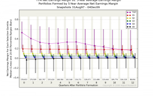
Our first example tracks the TTM (“Trailing Twelve Months,” i.e. the most recent 4 quarters) Net Margin after forming portfolios based on 5-Year Average Net Margins (click on the thumbnail for a full-size chart in a separate window).
The Quint Chart for Net Margin has a clear pattern to it. The performance of each portfolio, from top quintile to bottom quintile, continues quite close to the way it started right out of the gate, both in absolute and relative terms. Over the 12 quarters, or 3 years, covered by the portfolio tracking, only a small bit of overlap between the quintile portfolios is introduced, and a small bit of reversion to the mean is occurring. But overall, these effects are surprisingly small.
Quite differently, however, is how the Top 2% portfolio behaves. This is a portfolio consisting of outlier high net margin companies. Over the ensuing 4-6 quarters after portfolio formation, the TTM net margin of this portfolio falls rapidly, then levels out for a few quarters, and finally falls some more.
A portfolio consisting of the top quintile of 5-year average net margin companies largely remains at the same distribution of TTM net margins for some time. In other words, net margins appear to be quite persistent over time, changing only very slowly and slightly toward a middle value, with a notable exception being very high outliers that quite rapidly revert to more normal ranges.
5-Year Return on Invested Capital
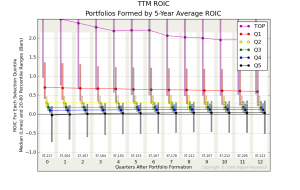
Our second example is similar, but looks at Return on Invested Capital.
For this analysis we have had to do a little more work. Our definition of Invested Capital is Net Plant, Property, & Equipment plus Current Assets, less Cash, Short Term Investments, and Current Liabilities, but adding Short Term Debt to the total. Our definition of “Return” in this case is Operating Income, i.e. income before taxes, one-time or exceptional income and expenses, and non-operating interest expense. And since ROIC is a ratio between numbers that could be negative, we have to distinguish between the cases where R is positive and IC is negative, and R is negative and IC is positive. The latter case is going to be relatively common and indicates a company in not very good shape. The former case is likely to be rarer but could indicate a company running extremely efficiently by essentially having its customers and/or vendors fund its operations. The problem is that R/IC is negative for both cases. We make sure we do not lump these cases together by simply eliminating the positive-R, negative-IC cases from this analysis.
We still see that the different portfolios maintain their ROIC distributions fairly clearly over time, but that reversion to the mean is occurring a little bit faster than for the Net Margin example above. The overlap between different portfolios increases more quickly than in the Net Margin analysis, and at the end of 12 quarters tracking the 3 middle portfolios overlap substantially as shown by the yellow, green, and blue 20-80 percentile bars at the far right bar group.
From the ROIC chart, we can probably conclude with reasonable confidence that:
- ROIC is quite persistent, at least for the 3 years analyzed, but slowly approaches a mean value
- ROIC variation increases slowly over time within each portfolio
- Highest (red) and lowest (black) ROIC portfolios continue to stay fairly distinctly outside the ranges of the middle portfolios
- The Top 2% (magenta) high ROIC outlier portfolio continues to show much higher ROIC than the other portfolios
- The uncertainty surrounding these conclusions is relatively low, at least over the following 3-year period
Virtually the same conclusions could be made about 5-year average net margin.
My own view is that ROIC is an especially important business evaluation metric. The fact that it appears to be quite persistent over time, especially for the more extreme values (both positive and negative), should provide some interesting ideas for investment evaluation.
Tags: estimates, longitudinal analysis, net margin, portfolio analysis, predictive, Quint Charts, roic, uncertainty


